
Ecommerce cohort analysis groups customers by a shared starting event, usually their first purchase month, and tracks how each group behaves across fixed time windows. That single view reveals the retention leaks that aggregate metrics bury completely. Your immediate move: run an acquisition-month cohort (m0 through m3) this week and fix the m0→m1 drop first, because that is where most stores lose the most recoverable revenue.
After reading this guide, you will be able to:
- Read a cohort table and diagnose the shape of your retention curve
- Run a basic cohort report in GA4 or with a SQL/pandas query
- Match cohort signals to specific interventions (post-purchase flows, push recovery, channel reallocation)
- Pick the right tool for your data maturity and team size
Average ecommerce retention sits around 30–31% across verticals. If your m1 number is below that, cohort analysis tells you exactly where to start.
Key Takeaways
Ecommerce cohort analysis is the most direct path from raw order data to retention decisions that compound LTV and reduce CAC payback windows.
| Point | Details |
|---|---|
| Fix m0→m1 first | The drop from first to second purchase is the highest-impact, most fixable leak in most stores. |
| Use vertical benchmarks | Apparel m1 ~15%, beauty 31%, supplements 31% — compare your numbers against your category, not a blended average. |
| Enforce minimum cohort size | Treat cohorts under 200 customers as directional only; require 500+ before reallocating acquisition budget. |
| Match tool to data maturity | GA4 for a free start, SQL for custom definitions, Mixpanel or Peel for automated weekly dashboards. |
| Act on one signal per cycle | Pick the biggest cohort drop, run one intervention, and measure its effect on the next cohort before adding complexity. |
Table of Contents
- What is ecommerce cohort analysis, and why do aggregate metrics mislead you?
- What cohort types and metrics should ecommerce teams track?
- How do you read a cohort table?
- How do you run a cohort analysis step by step?
- What actions should cohort signals trigger?
- Which tools help you run cohort analysis efficiently?
- What mistakes make cohort analysis unreliable?
- How cohort signals feed push-based re-engagement
- The part most cohort guides get wrong
- Sources
What is ecommerce cohort analysis, and why do aggregate metrics mislead you?
A cohort is a group of customers who share a common starting event. In ecommerce, that event is almost always the first purchase, and the cohort is defined by the calendar month it happened. Every customer who bought for the first time in March belongs to the March cohort. You then track that group's repeat purchases in April (m1), May (m2), June (m3), and so on, independently of every other cohort.
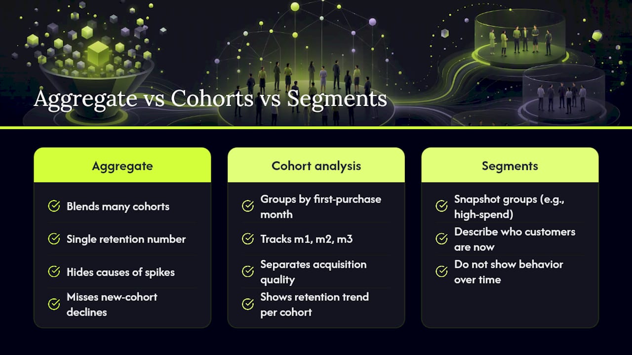
That independence is what makes it powerful. Cohort analysis separates acquisition quality, retention decay, and revenue concentration that aggregate metrics mask. Your overall monthly repeat-purchase rate blends customers from a dozen different cohorts, each at a different lifecycle stage. A spike in that blended number could mean your November cohort is repurchasing at m2, or it could mean your September cohort is unusually large. You cannot tell without separating the groups.
Here is a quick illustration. Your blended February repeat-purchase rate looks fine because the January cohort is still active. But February's new customers are walking away at twice the rate. You would never see that in a dashboard that shows one retention number for the whole store.
Cohorts vs. segments is a distinction worth making clearly. Segments are snapshot groups: high-spend customers, customers from California, customers who bought a specific SKU. They describe who your customers are right now. Cohorts describe how a group's behavior changes over time from a fixed starting point. Both are useful, but only cohorts show you whether a retention problem is getting better or worse with each new wave of customers you acquire.
What cohort types and metrics should ecommerce teams track?
Three cohort types worth building
Acquisition cohorts are the default and the right place to start. Group customers by first-purchase month, track repeat purchases, and you have the foundation for every LTV and CAC payback calculation your finance team needs.
Behavioral cohorts group customers by their first action rather than their first purchase. The most instructive example is customers who used a discount code on their first order. Coupon-use data supports what operators observe consistently, which is that discount-first customers often show lower long-term retention and LTV than customers who paid full price. Building a separate behavioral cohort for discount-first buyers lets you measure that gap instead of assuming it.
Product or SKU-first cohorts group customers by the category or product they bought first. A customer whose first purchase was a $12 lip balm behaves very differently over 12 months than one whose first purchase was a $90 skincare set. Breaking retention down by first-purchase category often reveals a 3–5x spread inside a single store, and that spread should directly inform where you point acquisition spend.
Key metrics and how to calculate them
| Metric | Formula | What it tells you |
|---|---|---|
| Retention rate (m1) | Customers who repurchased in m1 ÷ total cohort size | Share of first-time buyers who came back |
| Repeat purchase rate | Repeat buyers ÷ total customers (any window) | Broad loyalty signal |
| Orders per customer | Total orders ÷ cohort size (cumulative) | Purchase frequency over time |
| Cohort LTV | Cumulative revenue ÷ cohort size | Revenue per acquired customer |
| AOV | Revenue ÷ number of orders | Spend per transaction |
| Churn rate | 1 minus retention rate | Customers lost in a given period |
A quick example: your March cohort has 400 customers. In April, 88 of them place a second order. If March cohort revenue through m3 totals $48,000, cohort LTV at m3 = $48,000 ÷ 400 = $120 per customer.
Granularity and minimum cohort size
Monthly cohorts work for most stores. Weekly cohorts are useful when you run frequent promotions or want to isolate a specific campaign's customer quality. Daily cohorts are rarely stable enough to act on unless your order volume exceeds several thousand per day.
Minimum cohort size matters for statistical reliability. Longitudinal cohort comparisons are susceptible to small-sample noise, so treat any cohort smaller than 200 customers as directional only. For decisions that involve budget reallocation, aim for cohorts of 500 or more before drawing firm conclusions.
Vertical benchmark midpoints
| Vertical | m1 retention (typical) | m1 retention (strong) |
|---|---|---|
| Apparel | ~15% | 20% |
| Beauty | 31% | 25–35% |
| Supplements | 31% | 30–40% |
These operator-observed 2026 benchmarks from Eightx give you a starting comparison point. Your internal benchmarks by channel and product category will ultimately be more useful than any cross-store average.
How do you read a cohort table?
A standard cohort table is laid out with acquisition months as rows and months-since-first-purchase as columns. The cell at row "January," column "m1" shows what percentage of January's first-time buyers placed a second order in February. Peel Insights describes this structure clearly: rows represent the acquisition cohort, columns represent time elapsed since that first order.
Most tools color-code the cells from dark (high retention) to light (low retention). Reading diagonally from top-left to bottom-right shows you the same calendar month across different cohorts, which helps isolate seasonal effects from true retention improvement.
Three shapes to recognize:
-
The cliff. A large drop from m0 to m1, often from 100% down to 15–20%, with relatively flat decay afterward. This is the most common pattern and the most fixable. It signals that most customers never return after their first purchase, not that they churn gradually.
-
Stripes. Retention spikes at regular intervals, say m1, m4, and m7. This is a replenishment pattern, common in consumables like supplements or pet food. The stripe tells you the natural reorder cycle, which is exactly the window to target with a reminder or subscription nudge.
-
Long tail. Retention decays slowly and levels off above zero, meaning a stable loyal segment persists for 12+ months. This is the shape you want to grow. It usually indicates strong product-market fit or a subscription component.
Pitfalls when reading cohort tables:
- Seasonality. A November cohort will always look different at m1 because December is a high-purchase month. Compare November cohorts year-over-year, not against July.
- Small cohorts. A cohort of 40 customers showing 35% m1 retention is noise, not signal.
- Mixed verticals. If you sell both consumables and one-time-purchase items, a single cohort table blends two fundamentally different retention curves.
How do you run a cohort analysis step by step?
GA4 recipe
- Open GA4 and navigate to Explore → Blank exploration.
- Set the technique to Cohort exploration.
- Under Cohort inclusion, select "Make first purchase" (or use the
first_purchaseevent if you have it firing). - Set the Cohort granularity to "Monthly" and the Cohort size to the number of months you want to observe (3–6 months is a practical starting window).
- Choose your Return criteria: "Make any purchase" for retention rate, or "Revenue" for monetary cohorts.
- Add a Breakdown dimension (optional) such as acquisition channel to compare cohort quality by source.
Common GA4 pitfalls: attribution windows default to 30 days, which can inflate m1 numbers if a customer's second session is attributed to a new channel. Also watch for event duplication if your purchase event fires on both the order confirmation page and a server-side call.
Sample SQL query
-- Step 1: Assign each customer their acquisition month
WITH first_orders AS (
  SELECT
    customer_id,
    DATE_TRUNC('month', MIN(order_date)) AS cohort_month
  FROM orders
  WHERE status = 'completed'
  GROUP BY customer_id
),

-- Step 2: Join all orders back to get months-since-first-purchase
order_activity AS (
  SELECT
    o.customer_id,
    f.cohort_month,
    DATE_TRUNC('month', o.order_date) AS order_month,
    DATEDIFF('month', f.cohort_month, DATE_TRUNC('month', o.order_date)) AS month_number,
    o.revenue
  FROM orders o
  JOIN first_orders f ON o.customer_id = f.customer_id
  WHERE o.status = 'completed'
)

-- Step 3: Compute retention rate and cumulative revenue per cohort-month
SELECT
  cohort_month,
  month_number,
  COUNT(DISTINCT customer_id) AS active_customers,
  SUM(revenue) AS cohort_revenue
FROM order_activity
GROUP BY cohort_month, month_number
ORDER BY cohort_month, month_number;
Divide active_customers at each month_number by the m0 cohort size to get the retention rate. Sum cohort_revenue cumulatively to get cohort LTV at any time window.
Pandas pivot (for exported data)
import pandas as pd

# df has columns: customer_id, cohort_month, month_number, revenue
pivot = df.pivot_table(
    index='cohort_month',
    columns='month_number',
    values='customer_id',
    aggfunc='nunique'
)

# Divide each row by m0 cohort size
cohort_sizes = pivot[0]
retention_table = pivot.divide(cohort_sizes, axis=0).round(3)
print(retention_table)
Implementation checklist
- Define your cohort event (first completed order, not first session).
- Export or query at least 6 months of order history.
- Filter out cohorts smaller than 200 customers before drawing conclusions.
- Choose your metric: retention rate for behavior, cumulative revenue for LTV.
- Build the table in your BI tool or pandas pivot.
- Review weekly for leading indicators (m0→m1 for recent cohorts) and monthly for full analysis.
- Pick one intervention per cycle and measure its effect on the next cohort.
Pro Tip: Pair your cohort readout with a simple A/B test. If you add a post-purchase email sequence for new customers starting in April, compare April's m1 retention against March's baseline. That is the fastest way to validate whether an intervention actually moved the number.
What actions should cohort signals trigger?
The cohort table is only useful if it changes what you do. Here is how to map the most common signals to prioritized responses.
Launch a post-purchase email or push sequence within 48 hours of the first order. Improving retention by even 5% can move profits materially, and the m0→m1 window is where that 5% is most accessible.
Slow m2→m6 decay (retention falls gradually but never stabilizes): You have customers who intend to return but forget. Lifecycle winback sequences, subscription nudges at the natural reorder interval, and SMS or push reminders timed to the replenishment stripe are the right tools here. Pair cart abandonment recovery with cohort-timed outreach to catch customers who return to browse but do not convert.
The most decision-useful benchmark is internal: retention by acquisition channel or first-purchase product.
The product that acquires the best customers is not always the one with the highest conversion rate.
Statistic callout: Average ecommerce retention across verticals sits around 30–31%. Stores that move from 25% to 30% m1 retention often see compounding LTV gains that reduce CAC payback windows by weeks, not days.
The KPIs to watch when you act: m1 retention rate (leading indicator, visible within 30 days), 90-day cumulative LTV (confirms revenue impact), and CAC payback window (confirms acquisition efficiency). Track repeat purchase rate and purchase frequency alongside retention to verify that interventions move behavior, not just the metric.
Which tools help you run cohort analysis efficiently?
The right tool depends on your data maturity, team size, and how fast you need answers.
Decision guide
SQL is the right choice when you have a data warehouse (Snowflake, BigQuery, Redshift), an analyst who can write queries, and a need for custom cohort definitions that no off-the-shelf tool supports. The query above runs in any standard SQL dialect with minor adjustments. SQL gives you full control over cohort definitions, metric formulas, and output format.
GA4 is sufficient for stores that do not have a data warehouse and want a no-code starting point. The built-in cohort exploration covers acquisition-month retention and basic revenue cohorts. It is free, requires no additional setup beyond standard GA4 tagging, and produces a readable heatmap table. The tradeoff is limited flexibility: you cannot build product-level or behavioral cohorts without custom dimensions.
Product analytics platforms like Mixpanel or Peel accelerate the work when your team runs cohort analysis weekly and needs automated dashboards, multi-dimensional breakdowns, and non-technical stakeholder access. Mixpanel's cohort builder lets you define behavioral cohorts with event sequences (e.g., "first purchase → no second purchase within 30 days") and visualize retention curves without writing SQL. Peel is built specifically for Shopify and surfaces acquisition-month cohort tables, LTV curves, and product-level retention with minimal setup.
Tool comparison by category
| Dimension | Self-serve SQL | GA4 | Product analytics SaaS |
|---|---|---|---|
| Setup effort | High (requires warehouse + analyst) | Low (existing GA4 tag) | Medium (data connector + config) |
| Cohort granularity | Fully custom | Monthly/weekly, limited dimensions | High (event-level, behavioral) |
| Automation | Manual (scheduled queries) | Moderate (saved explorations) | High (automated dashboards) |
| Visualization speed | Slow (BI tool required) | Fast (built-in heatmap) | Fast (pre-built charts) |
| Cost | Warehouse + analyst time | Free | Paid subscription |
For most growing DTC stores, GA4 gets you started and SQL or a SaaS tool takes over once cohort analysis becomes a weekly habit. If you need ecommerce customer support scale alongside your analytics work, operational partners can handle fulfillment and service issues that cohort data surfaces.
Reusable assets: the SQL query and pandas snippet above are yours to adapt. GA4's cohort exploration is documented in Google's official Analytics Help Center under "Cohort exploration." Any visual templates you find in third-party repositories may carry a Creative Commons BY-NC-ND 4.0 license, so check attribution requirements before publishing them externally.
What mistakes make cohort analysis unreliable?
Getting the mechanics right is only half the job. These are the errors that produce misleading cohort tables.
- Cohorts that are too small. A 50-customer cohort showing 40% m1 retention has a confidence interval wide enough to be useless. Enforce a minimum of 200 customers before treating a cohort as decision-ready, and 500 before reallocating budget.
- Mixing product verticals in one table. Consumables and one-time-purchase items have structurally different retention curves. Blending them produces a number that describes neither accurately.
- Concluding too early. A cohort needs at least 3 months of observation before you can assess m2 behavior, and 6 months before you can speak to lifecycle retention. Pulling conclusions at m1 for a product with a 90-day replenishment cycle is premature.
- Ignoring returns and refunds. If your order data includes refunded transactions, your revenue cohorts are overstated. Filter completed, non-refunded orders before computing cumulative LTV.
- Comparing cohorts across different promotional periods. A cohort acquired during a Black Friday sale behaves differently from one acquired in February. Compare like-for-like periods or flag promotional cohorts separately.
Best practices:
- Set a consistent cohort window before you start (monthly is the default; weekly only if volume supports it).
- Remove promotional outlier cohorts when benchmarking against vertical averages.
- Schedule a fixed weekly readout for m0→m1 of recent cohorts and a monthly readout for full lifecycle analysis.
- Treat a cohort difference as meaningful only when it persists across two or more consecutive cohorts. A single cohort anomaly is usually noise.
Statistical confidence matters here. Longitudinal cohort comparisons are vulnerable to small-sample noise and censoring effects, meaning newer cohorts have less observation time and will always look worse at m3 than older cohorts simply because fewer months have elapsed. Never compare a 2-month-old cohort's m3 number to a 12-month-old cohort's m3 number as if they are equivalent.
How cohort signals feed push-based re-engagement
Here is a transparent example of how cohort analysis maps directly to a push-notification recovery experiment.

The cohort table shows the drop is consistent across three consecutive acquisition months, ruling out a seasonal anomaly. The team isolates a browse-abandonment cohort, specifically customers who returned to the site within 14 days of their first purchase but did not add to cart.
Using StorePush's iOS App Clip push notifications, the brand runs a recovery sequence targeting that browse-abandonment cohort: a push notification on day 3 post-browse, a second on day 7 with a product recommendation based on the viewed category. No email address or phone number required, because StorePush reaches shoppers directly on their lock screen through native iOS App Clips.
Expected lift ranges vary by vertical, creative quality, and push frequency. Results will differ by store, product category, and audience. What the cohort table provides is the targeting logic: you know which customers to reach, when to reach them, and what behavior you are trying to move. StorePush's dashboard then tracks revenue attribution and CTR by cohort, so the next month's cohort table reflects whether the intervention worked.
For stores running Shopify conversion optimization alongside push recovery, cohort analysis provides the diagnostic layer that tells you which optimization to prioritize. The push sequence is the intervention; the cohort table is the measurement.
If you want to see how StorePush maps to your specific cohort signals, book a demo or explore the StorePush platform directly.
The part most cohort guides get wrong
Most cohort analysis content stops at the table. It shows you how to build the heatmap, explains what the colors mean, and then hands you a list of generic retention tactics. That is where the real work begins, and most guides treat it as an afterthought.
The conventional advice is to "improve your post-purchase experience" when m1 is low. That is technically correct and practically useless without knowing which customers to target, through which channel, and at what moment. A cohort table without a recovery mechanism is just a well-formatted diagnosis with no prescription.
What actually matters is the pairing: cohort analysis tells you the who and the when, and your re-engagement channel determines whether you can actually reach them. Email works for customers who gave you their address. SMS works for customers who opted in. That is the gap most retention playbooks ignore entirely.
The other thing analysts underestimate: the cadence matters as much as the analysis. Brands that compound run cohort tables on a fixed schedule and make one prioritized change per cycle. The stores that stall run a cohort analysis once, feel good about having done it, and never build the habit. Weekly m0→m1 readouts for recent cohorts take 20 minutes once the query is set up. That 20 minutes, repeated consistently, is what separates stores that improve retention from stores that just measure it.
Start with the m0→m1 number. Fix that one leak. Then look at the next column.
Sources
- Cohort Analysis for Ecommerce: 2026 Guide | Smart Circuit
- eCommerce Retention Rate: How to Calculate It, Benchmark It, and Improve It in 2026 | Stormly
- Ecommerce Retention Benchmarks 2026: By Industry - MageLoyalty
- Coupon use in the United States - Statista