
The three highest-impact fixes are, in order: cut typing by enabling autofill and express wallets, remove pricing surprises by showing totals early, and make the flow fast and thumb-friendly with a sticky CTA. A one-second delay in mobile load speed can reduce conversion by up to 20%, and wallet adoption plus sticky CTA placement each tend to add measurable lift on their own. Everything below is a checklist you can act on this week.
TL;DR:
- Implement sticky primary call-to-action buttons in the thumb zone to significantly boost checkout completion rates on mobile devices.
- Reduce form length to only essential fields, ensure input types and autocomplete tokens are correct, and validate inputs in real time to lower abandonment.
- Use native wallet options like Apple Pay and Google Pay prominently to facilitate one-tap checkouts and minimize typing friction.
- Optimize load speed by serving appropriately sized WebP images, deferring scripts, and ensuring fast Largest Contentful Paint times to prevent revenue loss.
- Support session recovery and personalized regional payment options, with customized address formats and local currencies, to improve international and interrupted checkouts.
Table of Contents
- Mobile Checkout Best Practices Checklist, Ranked by Impact
- Form Design Details That Cut Typing And Errors
- Payments And Authentication: Wallets, One-Tap Flows, And 3DS
- Performance Fixes That Protect Mobile Conversion
- How To Diagnose And Test Mobile Checkout Problems
- Your 90-Day Roadmap For Mobile Checkout Improvements
- Handling Session Timeouts And Recovery Options During Mobile Checkout
- Security Practices Built For Mobile Checkout
- Localizing Mobile Checkout For Currency, Language, And Regional Payment Methods
- What Actually Moves The Needle On Mobile Checkout
- Turn Mobile Drop-Off Into Recovered Revenue
- Sources
Mobile Checkout Best Practices Checklist, Ranked by Impact
You don't need to rebuild your checkout from scratch. You need to fix the handful of things that are quietly bleeding revenue on every mobile session, and you need to fix them in the right order. Here's the list, ranked roughly by how much conversion each one tends to move.
- Sticky primary CTA in the thumb zone. Keep "Continue" or "Pay Now" pinned to the bottom of the screen in a single-column layout so the buyer never has to hunt for it. Sticky CTAs placed in the natural thumb reach zone have driven a measurable lift in checkout completion in A/B tests, one of the cheapest wins on this list.
- Cut the form down to what you actually need. Every extra field is a chance for someone to bail. Baymard's research treats excessive form length as one of the top drivers of checkout abandonment, and combined with broken autofill and undersized tap targets, it's a frequent, high-impact problem across mobile storefronts.
- Make guest checkout the default path, not a hidden link. Forcing account creation before purchase is still one of the most common ways stores talk themselves out of a sale. Nielsen Norman Group recommends making guest checkout visible up front, and usage data on guest checkout behavior among US shoppers backs up how often buyers choose it when given the option.
- Use the correct HTML input types and autocomplete tokens. This is a five-minute engineering fix that unlocks the browser's native autofill, which is the fastest way to remove typing without touching your design.
- Show final price, shipping, and tax estimates early. Buried costs at the last step are a classic trust killer. Surface a running order summary throughout the flow, not just at the final screen.
- Put Apple Pay, Google Pay, and Shop Pay somewhere obvious. Stripe's guidance is blunt about this: native wallet support is among the highest-ROI fixes you can ship, because it replaces an entire form with one tap.
- Compress images and defer anything that isn't essential. Target a Largest Contentful Paint under 2.5 seconds. Every second past that is measurable revenue walking out the door.
- Validate in real time and scroll straight to the first error. Nobody wants to resubmit a form three times because a single field failed silently below the fold.
- Put trust signals right next to the payment button. Security badges, accepted card icons, and a clear return policy link near the CTA reduce last-second hesitation better than the same content buried in a footer.
- Support camera-based card scan and address autofill where you can. NN/g's UX research on mobile checkout specifically calls out geolocation and camera capture as ways to remove typing entirely, not just reduce it.
- Never redirect unexpectedly, and never lose what someone already typed. A dropped connection shouldn't mean starting over. Preserve form state across network hiccups and app switches.
- Segment your testing by device before you trust any result. A change that helps desktop can hurt mobile, and blended data hides that every time.
Most stores get maybe three or four of these right on the first pass. That's fine. Fix the top few, then work down the list.
Form Design Details That Cut Typing And Errors
The fastest way to shrink your mobile checkout form isn't removing fields, it's making the fields you keep work with the browser instead of against it. Autofill only works when your input types and autocomplete tokens are correct, and most stores get this half wrong without realizing it.
- Add the standard autocomplete tokens to every field. Use
given-name,family-name,email,tel,address-line1,locality,region,postal-code,country,cc-number,cc-exp, andcc-csc. Browsers and password managers rely on these exact values to know what to fill in, so a mislabeled field silently breaks autofill even if it looks fine visually. - Combine what makes sense, split what doesn't. A single "Full Name" field is usually better than separate first and last name inputs on mobile, since it's one less tap and one less keyboard switch. But keep address line 2 hidden behind a toggle labeled something like "Add apartment or suite" rather than showing it by default.
- Respect the 44×44 pixel minimum for tap targets. This is Apple's own accessibility guideline, and it applies to checkboxes, radio buttons, and CTA buttons alike. Undersized tap targets are one of the most common causes of mis-taps that Baymard's mobile checkout research flags repeatedly.
- Use labels above the field, not placeholder text as the only label. Placeholder-only fields disappear the moment someone starts typing, so if they get distracted or the page reflows, they lose context on what field they're in. A persistent label above or floating within the field solves this.
- Validate inline, and scroll to the first error automatically. Don't wait for form submission to tell someone their email is malformed. Flag it the moment they leave the field, and if they do submit with an error, scroll and focus directly on the first invalid input rather than making them hunt.
- Build for assistive tech from the start. Use proper ARIA labels on custom inputs, keep contrast ratios high enough for low-light mobile viewing, and test that every field is reachable and operable using a screen reader like VoiceOver or TalkBack, not just a mouse and keyboard.
Payments And Authentication: Wallets, One-Tap Flows, And 3DS
Wallets belong wherever a buyer might decide to purchase, not just on the final payment screen. Google's own Google Pay UX guidance recommends placing the button on both the product page and checkout, positioned above manual entry fields so it's the first option a buyer sees, not an afterthought below a wall of form inputs.
- Use
isReadyToPayandCOMPLETE_IMMEDIATE_PURCHASEto enable true single-click checkout. These calls let you skip the intermediate cart review for buyers who've already got a payment method saved, cutting the flow down to essentially one tap. - Set the express wallet as the default selected option when a shopper has one available. Don't make them scroll past a credit card form to find it.
- Handle 3DS and one-time passcodes with as little friction as possible. Auto-read OTPs from SMS where the platform allows it, use progressive challenges so low-risk transactions skip extra verification, and always build a fallback flow for when auto-read fails.
- Tokenize payment data and only request what the transaction actually needs. Lean on your payment provider's SDK rather than building custom card storage, and resist the temptation to collect data "just in case" you need it later.
- Add buy-now-pay-later selectively, not everywhere. BNPL tends to help most on higher average order values, where splitting payments changes the buying decision. On low-AOV stores it can add checkout clutter without moving the needle, so test it against your own order value distribution before rolling it out.
Performance Fixes That Protect Mobile Conversion
Speed isn't a technical nice-to-have on mobile checkout, it's a direct lever on revenue. A one-second delay in load speed can cut conversion by up to 20%, which makes performance work some of the highest-ROI engineering time you can spend this quarter.
- Serve WebP images sized for the actual display, not the source upload. Product thumbnails on checkout and cart pages should target roughly 15KB where possible, and always account for retina displays rather than shipping one oversized asset to every screen.
- Defer or remove synchronous third-party scripts. Many Shopify stores recover one to two seconds of load time just by auditing and deferring app-injected JavaScript that runs on every page whether it's needed or not.
- Use
fetchpriorityandloadingattributes deliberately. Mark your hero product image or CTA-adjacent content as high priority, and lazy-load everything below the fold. - Inline critical CSS and subset your fonts. Loading a full font family when you're using three weights is dead weight on every mobile connection.
- Target Largest Contentful Paint under 2.5 seconds and Cumulative Layout Shift under 0.1. These aren't arbitrary numbers, they're the thresholds where user-perceived speed and layout stability stop causing drop-off.
- Build for spotty connections, not just fast ones. Preserve form state locally so a dropped signal doesn't wipe out what someone already typed, add retry logic for failed payment submissions, and design confirmation states that don't leave a buyer wondering if their order actually went through.
If your team needs a deeper technical pass on image and script handling across the whole storefront, the complete Shopify conversion optimization guide walks through the same principles at the platform level. For general speed and caching tactics beyond checkout, Kirk & Co.'s guide to website speed is a useful companion resource.
How To Diagnose And Test Mobile Checkout Problems
You can't fix what you haven't measured, and blended desktop-mobile data will lie to you about what's actually broken. Here's a repeatable way to find and validate the real blockers.
- Build device-specific funnels in your analytics tool. Track checkout step one, payment entry, and confirmation separately for mobile versus desktop. A steep drop between step one and payment on mobile specifically usually points to form friction or missing wallets, not pricing.
- Watch 10 to 20 session recordings of failed mobile checkouts before you touch anything. Rage-tap filters make this fast. A practical CRO audit approach built around this exact sample size tends to surface the same two or three blockers, like mis-taps on undersized buttons or repeated validation loops, again and again.
- Run A/B tests segmented by device, OS, and viewport, and never mix mobile and desktop traffic in the same test. A checkout change that lifts desktop conversion can quietly hurt mobile, and averaged results will hide it every time.
- Run a quick diagnostic audit before any test. Check keyboard types per field, confirm autofill actually populates correctly on a real device, verify the sticky CTA appears above the fold, and check that wallet buttons render on both iOS and Android.
- Set realistic expectations for each fix. Sticky CTA placement tends to land in the 5% to 12% completion lift range, wallet adoption often delivers a comparable or larger lift depending on your current payment mix, and image compression paired with script deferral commonly recovers one to two full seconds of load time.
For a broader look at how checkout data connects to what happens earlier in the funnel, this piece on optimizing beyond the 7% who add to cart is worth a read alongside your own funnel numbers.
Your 90-Day Roadmap For Mobile Checkout Improvements
Sequence matters here. Ship the cheap, high-leverage fixes first, then move into the work that needs engineering time and real testing cycles.
- Weeks 0 to 2: Add the sticky CTA, fix input types and autocomplete tokens, surface shipping estimates earlier in the flow, and make guest checkout the visible default.
- Month 1: Roll out Apple Pay, Google Pay, and Shop Pay across product, cart, and checkout pages. Compress your checkout-flow images and defer nonessential third-party scripts.
- Months 2 to 3: Tune LCP and CLS, launch device-segmented A/B tests on your riskiest checkout changes, and strip out any app-injected scripts that aren't earning their weight.
- Beyond 90 days: Consider a progressive web app or native app experience for your highest-repeat customer cohorts, and test push-notification-based recovery for the buyers who still drop off despite everything above.
- Track these KPIs throughout: mobile checkout completion rate, per-step conversion between cart and confirmation, and LCP improvement measured on real mobile devices, not just lab tests.
Handling Session Timeouts And Recovery Options During Mobile Checkout
Mobile buyers get interrupted constantly. A phone call, a notification, an app switch to check a text message, and suddenly your checkout session is at risk of timing out before payment completes. If your session length is tuned for desktop behavior, you're punishing exactly the buyers you worked hardest to get this far.
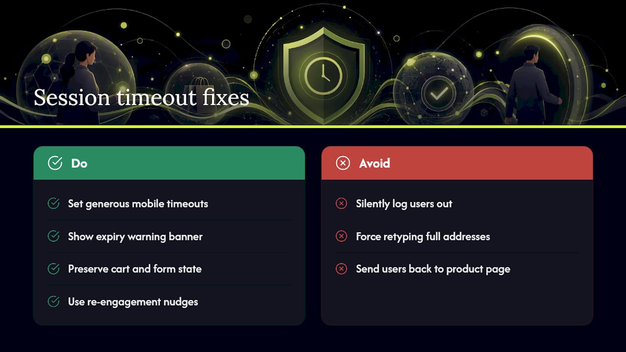
Set session timeouts generously on mobile, and always warn the buyer before the session actually expires rather than silently logging them out mid-payment. A simple banner reading "Your session will expire in two minutes, tap to continue" gives people a chance to save the sale themselves.
When a session does time out, preserve everything you can: cart contents, entered shipping details, and selected payment method where your payment provider's tokenization allows it. Nothing kills a mobile conversion faster than forcing someone to retype a full address because they took a call. If full state can't be preserved, at minimum keep the cart intact and let the buyer resume from checkout entry rather than the product page.
This is also where a re-engagement layer earns its place. A re-engagement tool can nudge a shopper who was interrupted mid-checkout back to their cart, even without an email address or phone number captured, which matters because most abandoning mobile visitors never handed over that information in the first place.
Security Practices Built For Mobile Checkout
Mobile checkout security has to work within thumb-sized screens and short attention spans, which means the friction has to be invisible when it matters and obvious when it needs to be.
Biometric authentication, Face ID, Touch ID, and Android's fingerprint unlock, should back every saved payment method whenever the device supports it. It's faster than a passcode and it reads as more trustworthy to the buyer, since they're authenticating with their own device rather than typing a card number into a form they can't fully see at once.
PCI compliance on mobile carries the same core requirements as desktop: never store raw card data on your own servers, and route all payment collection through a PCI-compliant processor's hosted fields or SDK. The mobile-specific risk is usually in the integration layer. In-app browsers, embedded webviews, and third-party checkout scripts injected by storefront apps can inadvertently expose card fields to scripts that shouldn't have access to them. Audit every script running on your payment step, not just the ones you added intentionally.
Tokenization matters more on mobile than almost anywhere else, since mobile buyers are more likely to save a card for one-tap future purchases. Make sure your provider tokenizes at entry and that your systems never see or log the raw card number at any point in that flow.
Localizing Mobile Checkout For Currency, Language, And Regional Payment Methods
A checkout that converts well domestically can quietly fail international buyers, and the failure is usually invisible unless you're segmenting data by region. Currency mismatch is the most common issue: showing a price in US dollars to a shopper who thinks in euros or pounds adds a mental conversion step that kills momentum right before payment.
Detect location and default to local currency and language automatically, but always let the buyer override it. Auto-detection gets it wrong often enough, through VPNs, shared devices, or imprecise geolocation, that a manual toggle is not optional.
Regional payment method support matters as much as currency. A wallet or payment method that dominates one market can be nearly unused in another, so a one-size-fits-all payment stack quietly caps your international conversion ceiling regardless of how fast or clean the rest of your checkout is. Research your top international traffic sources and match payment options to what buyers there actually expect to see, rather than assuming your domestic wallet mix travels everywhere.
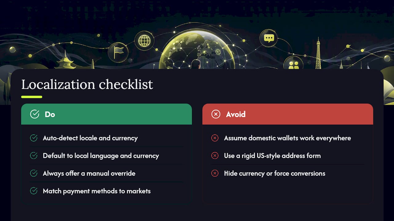
Address formatting needs the same localized attention. Postal code formats, region and state fields, and even the order of address lines vary by country, and a rigid US-style address form will frustrate or outright block international buyers from completing checkout at all.
What Actually Moves The Needle On Mobile Checkout
Most teams over-index on visual polish and under-index on typing. A checkout can look beautiful and still lose half its mobile traffic to a single mislabeled autocomplete field or a wallet button buried below three screens of form inputs. The fixes that consistently move numbers are boring: fewer fields, correct input types, wallets placed where people actually look.
The trade-off nobody likes to admit is that some of the highest-impact work, like removing app-injected scripts or renegotiating a payment provider integration, competes directly with marketing's roadmap for engineering time.
Start with a real-device audit, not a simulator. Run three or four A/B tests instead of twelve, segmented by device from day one, and fix the typing before you touch the design.
— Lucas
Turn Mobile Drop-Off Into Recovered Revenue
Every fix in this checklist reduces how often shoppers abandon your mobile checkout. That's the gap this kind of solution was built to close: using native iOS App Clips to send push notifications straight to a shopper's lock screen after they abandon, without ever needing to collect their contact information first.
If you've shipped the wallet integrations, tightened your forms, and fixed your LCP score but still see mobile visitors vanish at the last step, the next lever isn't another checkout tweak, it's re-engaging the shoppers your checkout couldn't convert the first time. Book a demo with StorePush to see how push-based recovery fits alongside the fixes above, or visit Storepush to explore how it integrates with Shopify, WooCommerce, BigCommerce, and custom storefronts.
Sources
- The Mobile Checkout Experience | Nielsen Norman Group
- User experience best practices | Google Pay API for Android
- Mobile checkout best practices: optimizing payment flows for smartphone users | GR4VY
- Mobile checkout best practices for ecommerce businesses | Stripe